- Published on
Image rendering based on pre-defined image container width and pixel density ft. ImageKit
- Authors

- Name
- Galih Laras Prakoso
- @galihlprakoso

I decided to start to write some blog posts related to my engineering activities on Sayurbox (my current company.). This time I will share one of our small parts on rewriting and unifying the codebase of our consumer apps (desktop, mobile web, ios, android).
It's about image rendering. Image rendering is very important in e-commerce applications like Sayurbox. Because looking at the image is one of the main ways for our customers to "justify" our products. The pixelated image will impact customer experience, and in the worst use case, it can demotivate our customers to buy our products.
Why we don't just blindly give them high-resolution images?
High-resolution images (high-resolution images) will have a big size right? so it will take a quite long time to fetch that high-resolution image from the server. So we can't just blindly send the user high-resolution images for all parts where the image will be displayed, because it will hurt the app performance and also the customer experience, it will not solve our problem to improve our customer experience because the consumer has to wait a bit longer to load the high-resolution image.
Where do we render our product images?
There are four places where we render the product images. Those are:
Homepage Custom Section
We have a custom section on our homepage that renders two types of image, the first is the horizontal banner and the second one is the square image on the product item.
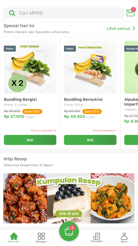
Homepage Banner
And also we render image promotion banners on our homepage inside our carousel component.

Product Detail
Next, we have a product detail page. Currently, we only have a single image to display our product on our product detail page.

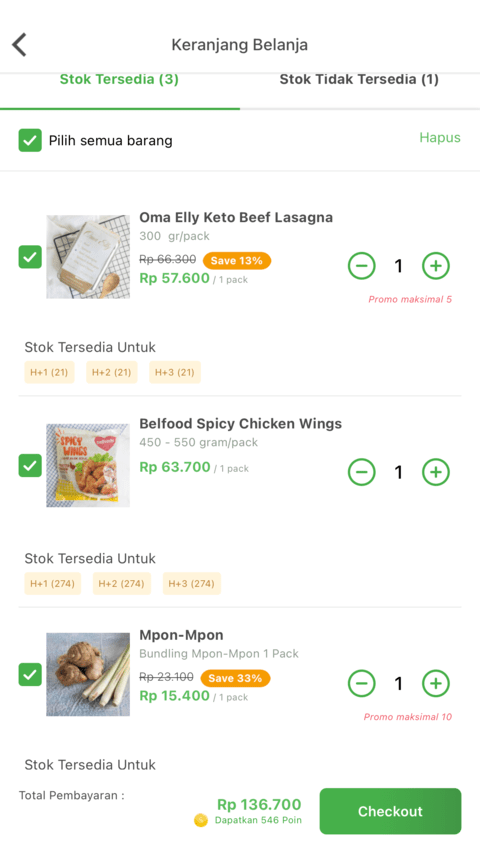
Cart Item on Cart Page
And the last one is in the cart item on the cart page. It's a very small square image for each cart item.
High Resolution vs Image Size in Byte
When we increase the image resolution the image size in a byte will also be increased. So, to solve this problem we need to think about how to serve just the correct image for each different pre-defined size on each image container. And also, the pixel density of the device should also be considered to serve the correct image for our customers.
Device Pixel Densities
The pixel density for each device until now varies from 1 to 3.5. This is the sample pixel density for some devices:
| Device | Pixel Density |
|---|---|
| mdpi Android devices (160dpi) | 1 |
| hdpi Android devices (240dpi) | 1.5 |
(iPhone 4, 4S), (iPhone 5, 5c, 5s), iPhone 6, iPhone 7, iPhone 8, iPhone SE, xhdpi Android Devices (320dpi) | 2 |
iPhone 6 Plus, iPhone 7 Plus, iPhone 8 Plus, iPhone X, xxhdpi Android devices (480dpi) | 3 |
| Nexus 6 | 3.5 |
Calculating The Correct Image Resolution
To calculate the correct image resolution for certain image containers and devices we can use this formula to specify the correct image width to be rendered. Why only width? because the height would also be auto-calculated based on the width and the ratio of the original image.
Let's say we have:
= the width of the image container size.
= device pixel density.
To calculate the correct width, we could define the formula to be like this:
Yeah, it's a very simple formula. It's just the multiplication of the width of the image container and the pixel density of the device.
ImageKit
To serve our image in Sayurbox, we decided to use ImageKit. ImageKit is a CDN with automatic optimization, real-time transformation, and storage that you can integrate with the existing setup in minutes.
Because the image resolution calculation and image optimization is already handled by ImageKit, the front-end only need to specify the parameters which are image container width and the device pixel density and by those parameters, ImageKit will do the magic to give the correct image with the correct resolution to be rendered on the front-end.
Generating ImageKit URL
Previously, we already use this concept but the ImageKit URL generation is handled by our GraphQL server. So for example, the GraphQL query to fetch product image would be like this:
query getProduct ($slug: String, $imageWidth: Int) {
  getProduct(slug: $slug) {
    ...
    image {
      id
      alt
      fullUrl(width: $imageWidth)
    }
    ...
  }
}
As you can see, we're not passing the pixel density of the device yet to the GraphQL server to generate the correct ImageKit URL. And after some brainstorming, we also think that generating the URL on the GraphQL server seems to be inconvenient way because we should pass the width and pixel density on each query.
ImageKitRenderer Component
That's why we decided to create a renderer component that will have the responsibility to generate the ImageKit URL. The component will receive two parameters: pre-defined image container width and the ImageKit image ID. We can get the pixel density of the device by using one of React Native libraries called PixelRatio.
import { PixelRatio } from 'react-native'

const pixelDensity = PixelRatio.get()
And this is the full code of our ImageKitRenderer component:
/* eslint-disable react/jsx-props-no-spreading */
import React, { useMemo } from "react";
import { StyleSheet } from "react-native";

import Image, { ImageProps } from "../../lib/ui/primitives/Image";
import useRuntimeSettings from "../hooks/useRuntimeSettings";
import useViewerContext from "../hooks/useViewerContext";

interface ImageKitRendererProps extends ImageProps {
  imageKitID: string;
}

const ImageKitRenderer = React.forwardRef<Image, ImageKitRendererProps>(
  ({ imageKitID, style, width, ...props }) => {
    const runtimeSettings = useRuntimeSettings();
    const viewerContext = useViewerContext();

    const imageKitURL = useMemo(() => {
      if (!imageKitID) return null;

      const generatedImageKitURL = new URL(
        `${runtimeSettings.imageCdnUrl}/${imageKitID}`
      );
      const pixelDensity = viewerContext.deviceInfo.pixel_density;
      const imageWidth =
        width || ((StyleSheet.flatten(style) as any).width as number);
      const imageKitSearchParamsArr = ["f-auto"];

      if (imageWidth) {
        imageKitSearchParamsArr.push(`w-${imageWidth}`);
      }
      if (pixelDensity) {
        imageKitSearchParamsArr.push(`dpr-${pixelDensity}`);
      }

      generatedImageKitURL.searchParams.set(
        "tr",
        imageKitSearchParamsArr.join(",")
      );

      return generatedImageKitURL.toString();
    }, [imageKitID, style, width]);

    return <Image {...props} src={imageKitURL} />;
  }
);

export default ImageKitRenderer;
What we're doing here is just wrap our primitive's Image component and generate ImageKit URL based on ImageKitRenderer props which are imageKitID and width. The width could be passed directly via props, or just define as a style.
const imageWidth =
        width || ((StyleSheet.flatten(style) as any).width as number);
And for the pixel density, we already pre-calculated it and save it in our deviceInfo variable inside the viewerContext object.